It’s reveal week, and I have to say I am happy dancing over here. This was my third One Room Challenge, and this one was GRUELING! But just like childbirth, it was totally worth it! I can say that now that we are on the other side. Why so grueling? Two things. I chose to update our Lake House kitchen, which is an hour and a half from our home. Weekends were the only time we had to work on it. And my friends that made for some really long evenings. Reason two, everything we did was new to us. The countertop install, the tiling, and wallpaper hanging… we were total DIY virgins with those things, and I did not factor the learning curve into our timeframe. Did I mention how happy I am that it’s done?!?!? And can I secretly mention I am already planning a bathroom remodel for the Fall??? I hope my husband is not reading this. He’s going to need at least the summer before I bring that up that to him. 🙂
Here was our progress by week: Week 1/ Week 2/ Week 3/ Week 4/ Week 5
And without further ado, our Kitchen Refresh at the Lake:
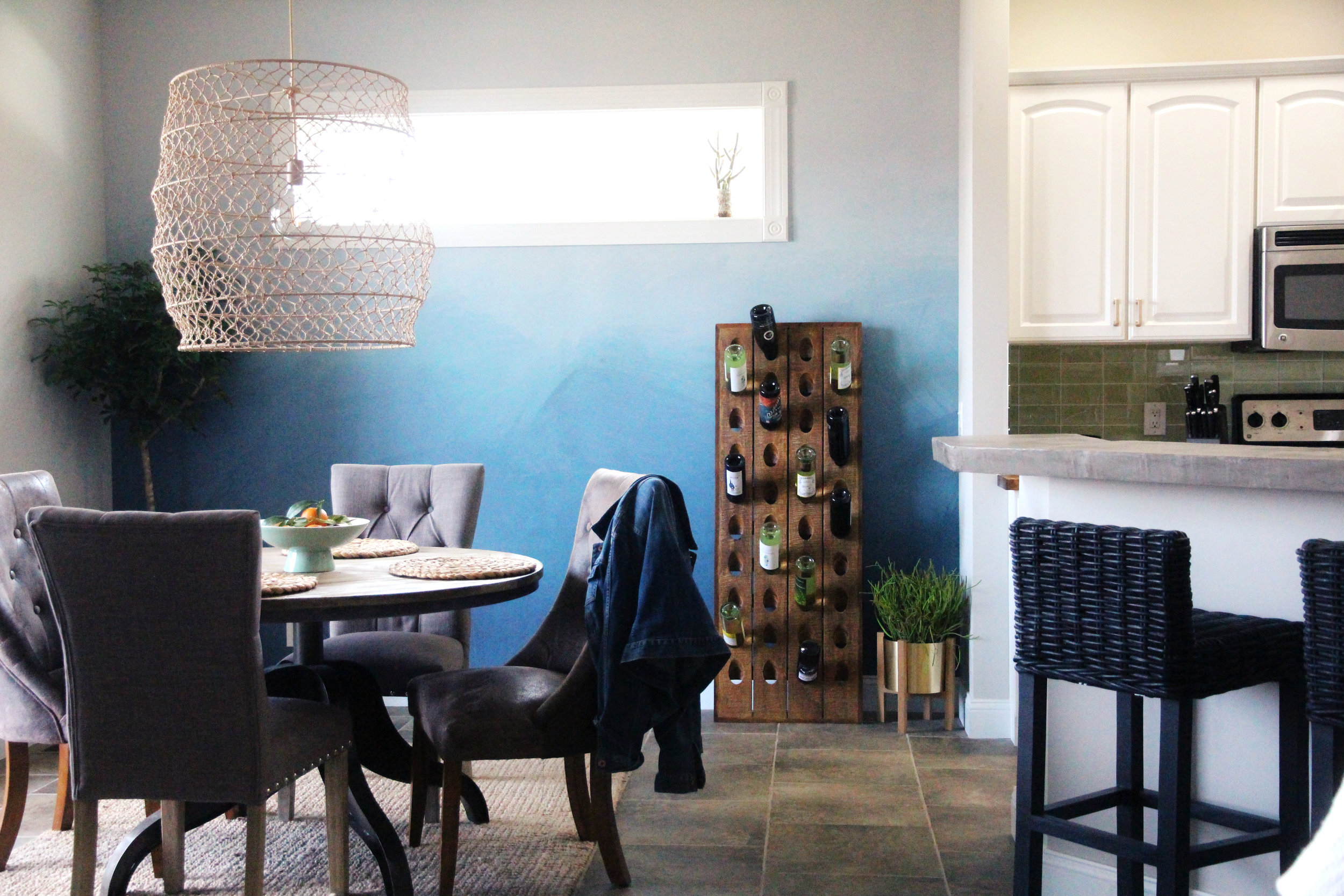
Anewall Wall Mural
And just because I love a good before and after….here is what the space looked like when we bought the house 3 years ago.
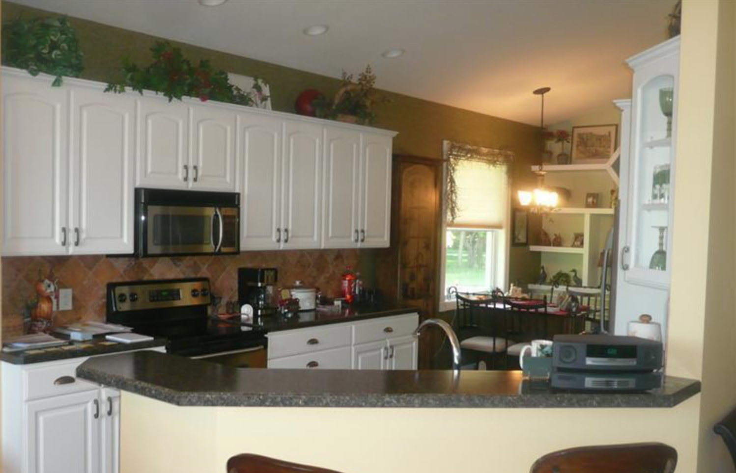
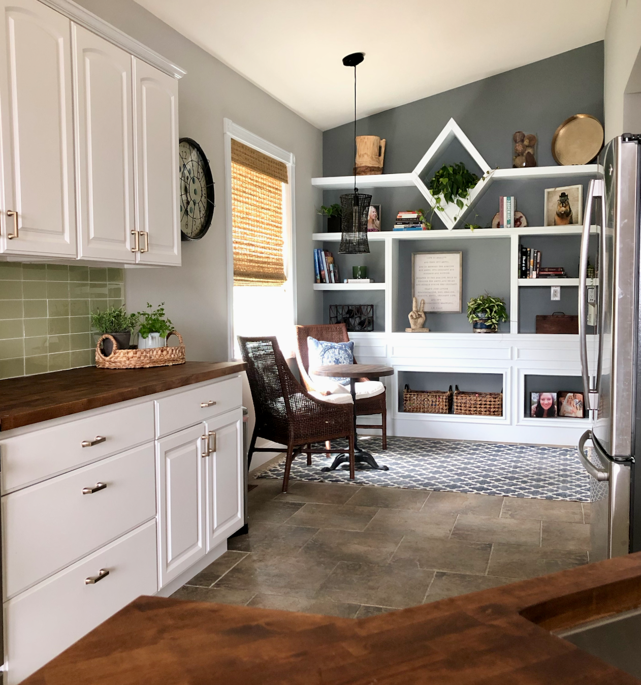
Kitchen Refresh
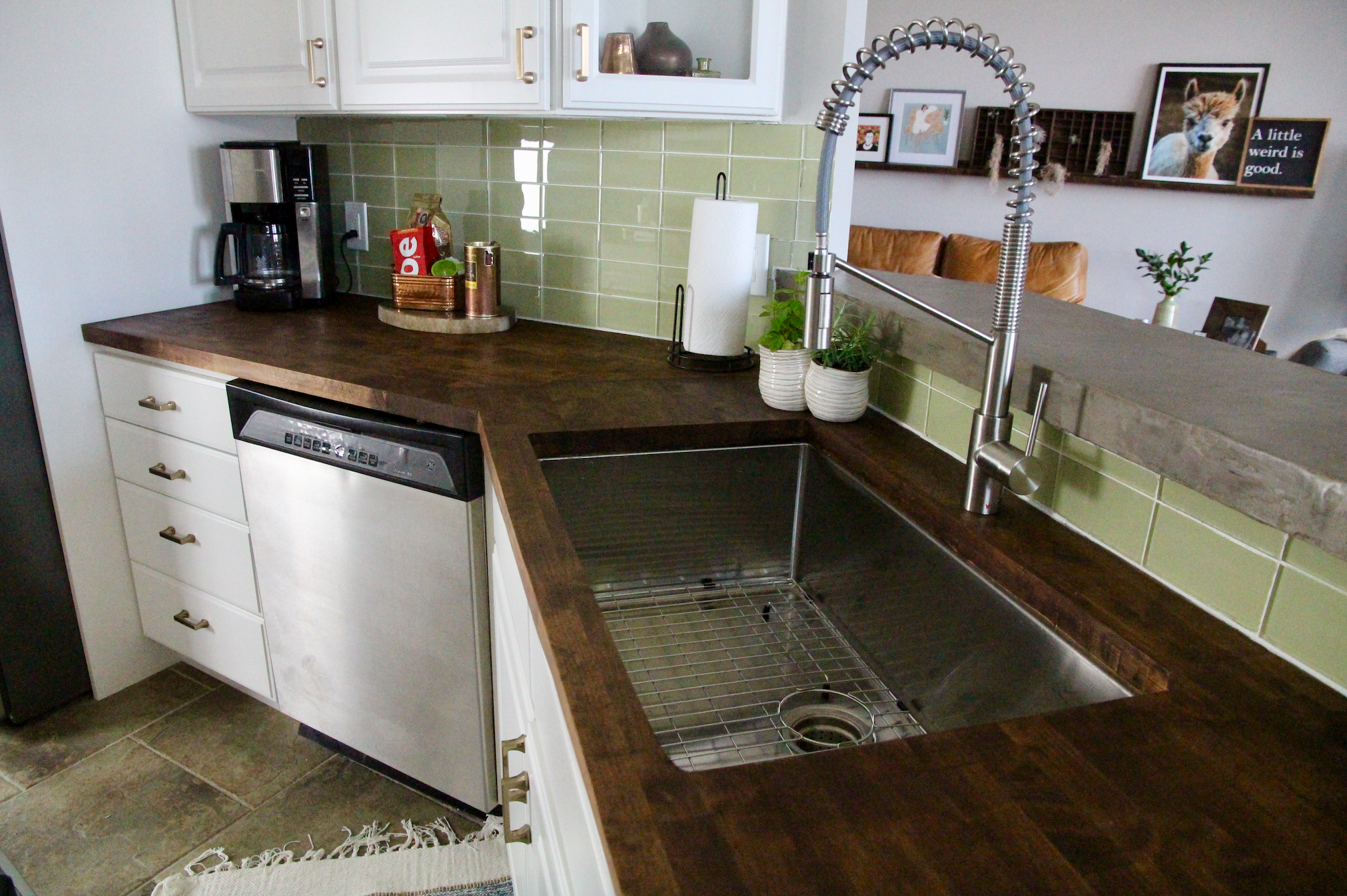
New Sink and Faucet.
This kitchen is a typical galley kitchen, and I love the white cabinets but wanted to bring it out of the dated 90’s feel it had. I also wanted to warm the space up a bit.
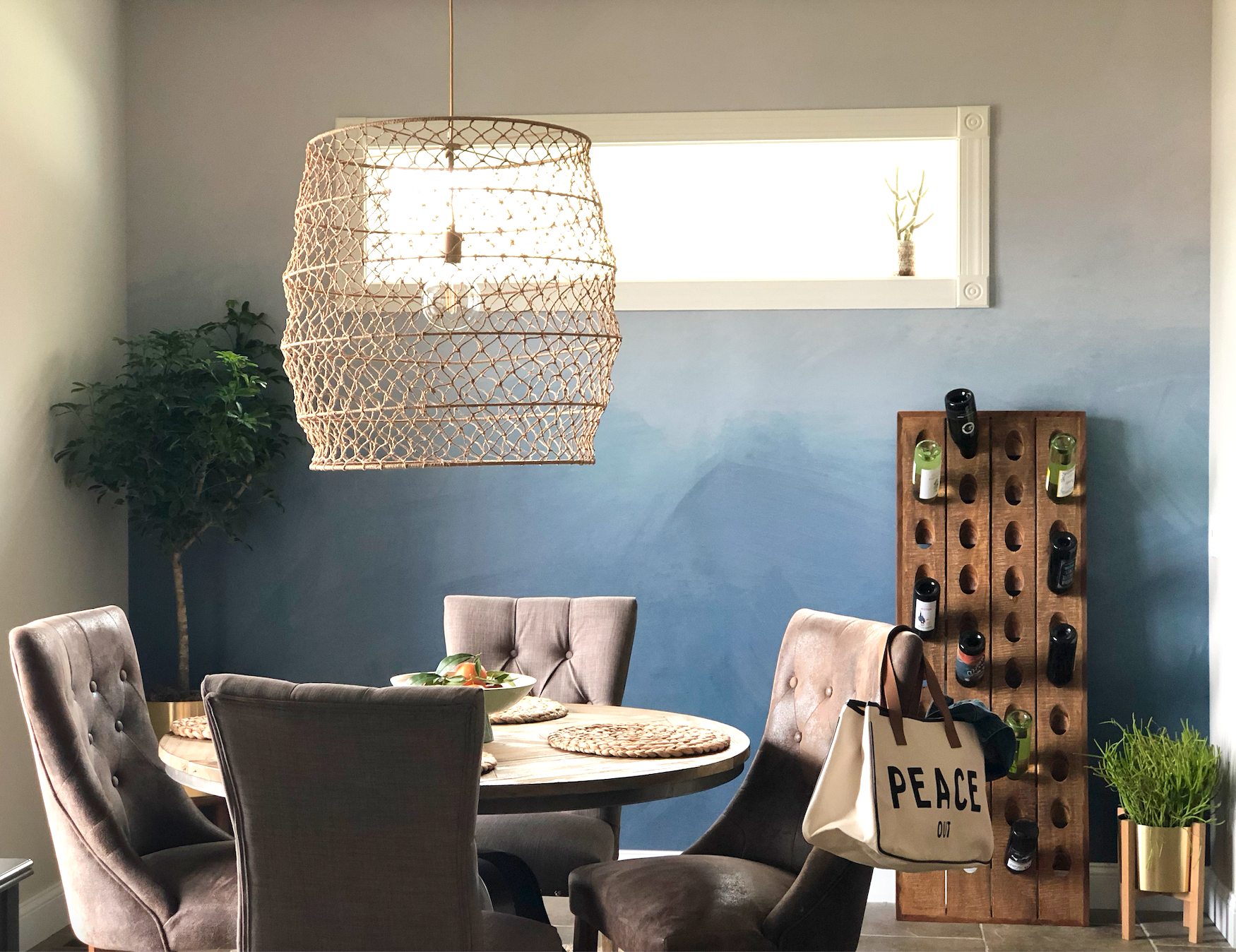
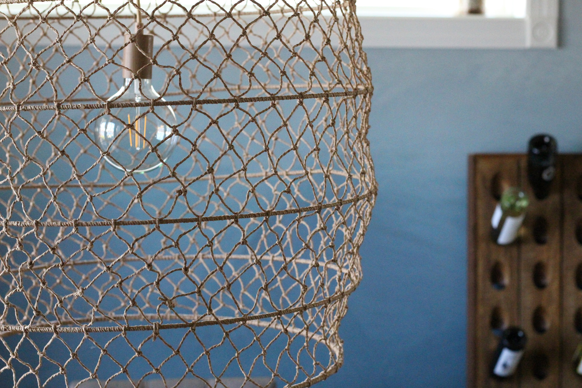
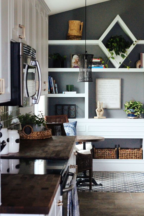
First, we added the wall mural by Anewall. I LOVE the beautiful blues that help capture the feel of sky and water. Perfect for a Lakehouse vibe. We also switched out the old lighting for this open, airy piece. I love that it has size and texture, but you can still see the view of the lake through it.
The main updates we wanted to complete were the countertops and backsplash. We decided on butcher block for the warmth (and cost) for countertops and then went with concrete on the bar top (it’s actually a skim coat product). I love how both turned out.
I partnered with The Tile Shop for the backsplash, and I LOVE the green glass tile we choose. It bounces light around much better than the previous stone tile, and the color actually ties in with the floors so well that I find I’m not hating on the floors nearly as much! As a bonus, my local team at The Tile Shop was extremely helpful with advice for us as first-time tile newbies.
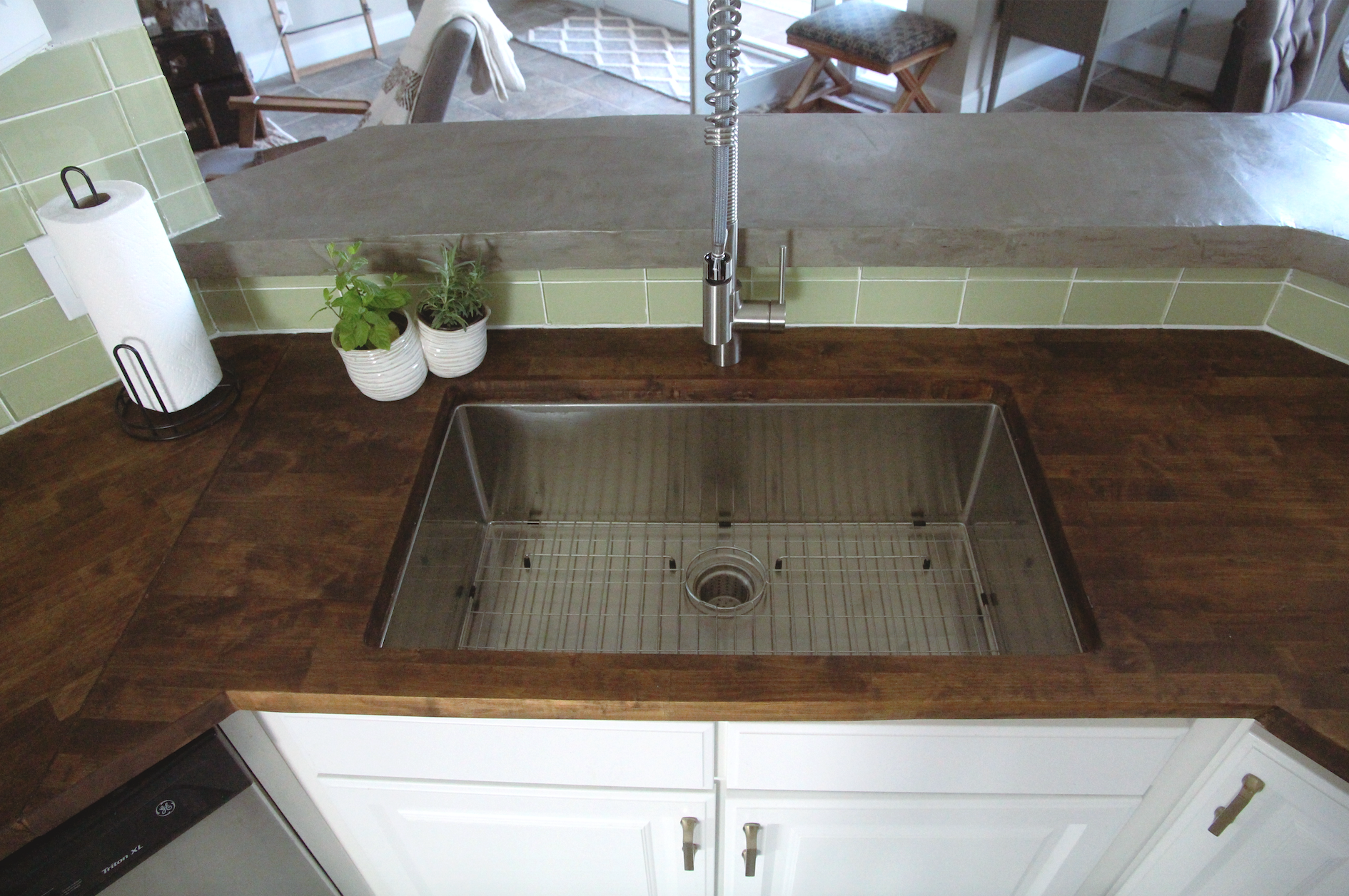
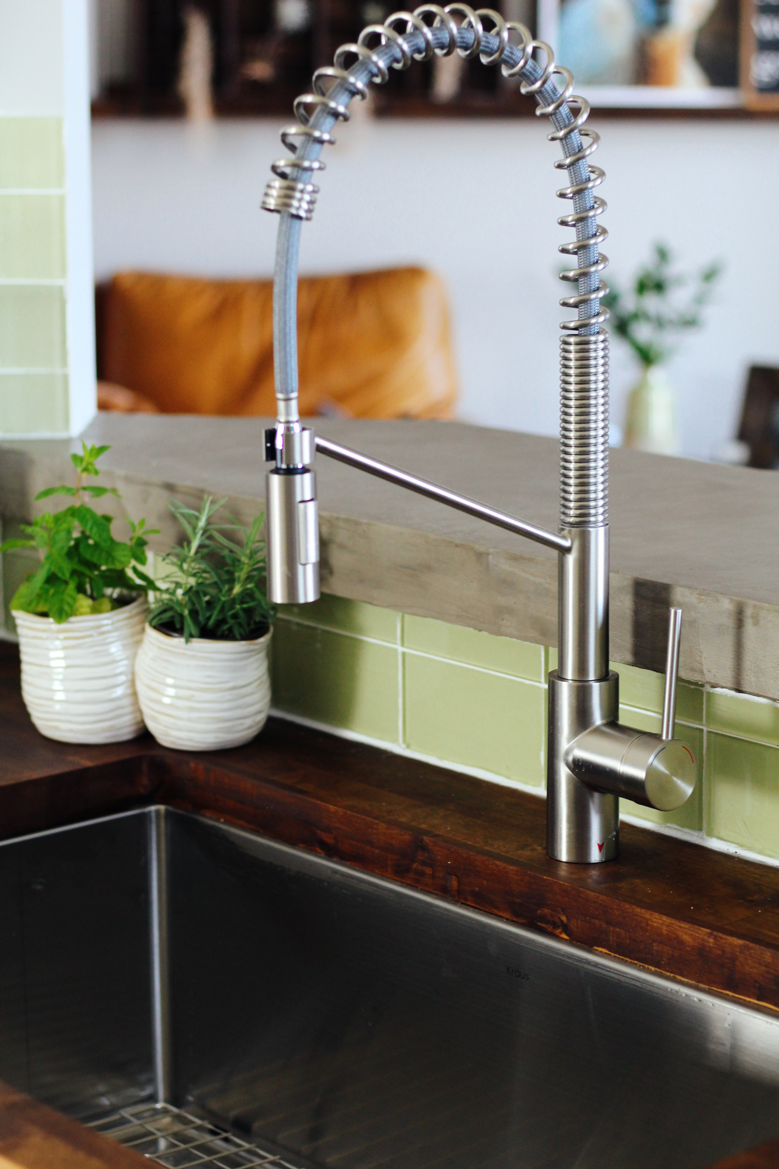
Since we were removing the countertops, we took the time to update the sink to this new sexy beast by Kraüs. It’s HUGE and a single basin which I am loving. The faucet is by Kraüs also.
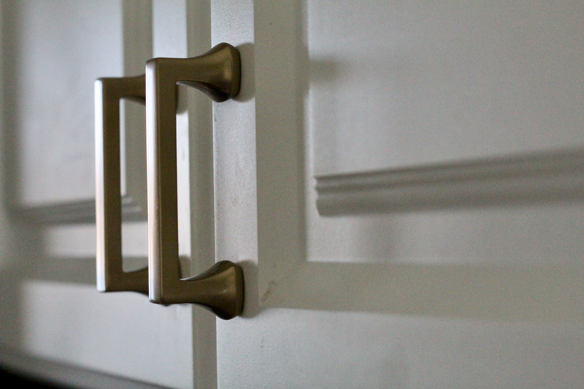
New Hardware is one of the quickest and easiest ways to update your kitchen cabinets. Ours had some swirly chrome pulls that screamed 1998. I chose a warm champagne bronze from D. Lawless Hardware with a simple profile, and it instantly changed the feel of the cabinets. The warmth of the champagne bronze looks beautiful against the green tile and the butcher block counters.

Butcher Block Counter
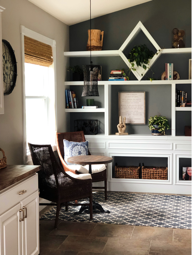
I also wanted to add some warmth to the breakfast nook. It gets a nice dose of sunshine, so it’s a perfect place to have a cup of coffee in the morning. I chose a new woven blind from Blindsaver to add some texture (and help with that morning sun) and painted the back of the built-ins, which turned out to be one of my very favorite changes. I also changed the light fixture to a more casual feel.
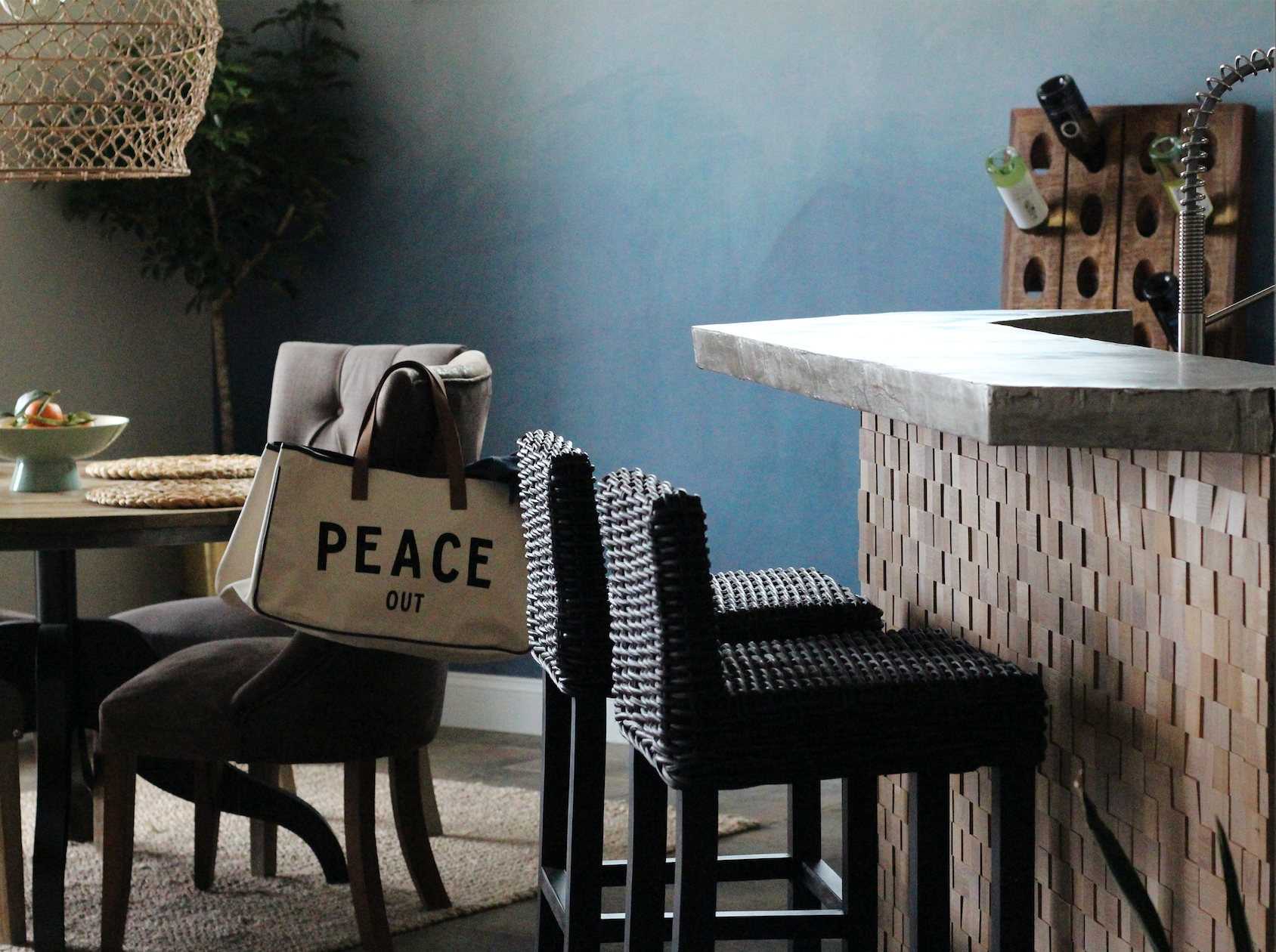
Once we were getting to the end of the refresh, I decided we needed something under the countertop where the barstools are. I had noticed that even though we had recently painted the wall, it was getting pretty scuffed from people’s knees and the grandkids eating there. It’s a high-use spot during the summer, so I decided to add something to protect the wall. I found Timberwall they specialize in wood products that are a breeze to install. Win-Win!
We then added the simple black barstools that have a lower profile. I love that the backs are not sticking up over the counter.
We are so excited to host guests again this summer.

I would like to take a moment to thank Linda at Calling it Home for this amazing event that I have come to love so much and Better Homes and Garden this year’s media sponsor.
I also want to thank the following sponsors:

Take a minute to go check out the other amazing spaces! I’m sure you will find them as inspiring as I do!
Featured designers are here, and Guest Participants are here!

That’s a wrap on the Spring One Room Challenge.
Until next time,
-Libbie

Libbie!!! It’s fabulous! LOVE the green tile with the butcher block. Every detail is perfect.
Susie,
I am over the moon with how it turned out!
What a beautiful reveal, Libbie! How awesome it must be to have a lake house. Hey, I’ll take an hour and half drive any weekend :). I love the color you painted on your built-in shelves! Enjoy that new large basin and beautiful faucet. Congrats on a great job!
Thanks Tee!
Those built-ins are a favorite of mine. I am liking the darker color way more than I thought I would!
Everything is so pretty! I really love the wood on the front of the bar! And the mural. Great job!
Thank you, Emy! It was a last minute idea that worked!
What a great job! I love the wood counters with the green glass tile.
Thank you my friend! It’s been so nice following along with you on this journey.
Whoa that ombre wall, the wood counters and that block wall! You killed it Libbie! Fantastic job girl!
I’m so in LOVE! The wall still has me cheering!
What a great transformation! Love it Libbie and that wall is beautiful!
Thank you, Joannie! I do love the mural perfect for the lake house.
It looks so great! I love the mural – everything turned out so beautiful 🙂
Thank you, Casey! The mural is one of my favorite elements!
Wow wow wow!! What a reveal!! It’s stunning! I love the wood counters! And the hardware pops against those cabinets – awesome job!
Thank Jen!
Hardware is such a small thing yet makes such a huge impact! I am loving the new pulls.
Libby you rocked this space! I love the wall under the bar top. What a beautiful application of textures in this kitchen. You really warmed the space up.
Thanks Eva! The wall was such a last minute add on that I haven’t really gotten to appreciate it yet. Dave was adding it as the photos were being taken. 🙂
Great job Libbie! I am impressed that you did all the work yourselves! I love the wall under the bar and those butcher block countertops. Love the big basin sink too! I bet you’ll have a lot of fun there this summer!
Thank you , Laura!
We are soo looking forward to the summer now that this project is checked off our list!
It turned out great! I love your wine rack, it’s so cool!
Thank you, Andi! We are really happy with the updates. The Wine rack- Pottery Barn and it’s nice since a lot of people come to the lake with a bottle of wine in hand!
Those light fixtures are so amazing and they just make the whole space!
Right?!! My husband was shocked at how perfect they were at Target price points! I love them.
Oh wow, that’s such a beautiful kitchen! The tiles add such a lovely soft pop of color. The butcher block counters are stunning!
Thank you. Now I hope I can maintain those counters! 😉
OMG, Libbie!! Your kitchen makeover is gorgeous! I LOVE the wall mural and all of the other details that you put into it. Stunning!
Thank you, Wanda! I am loving the mural. It’s perfect for the lake. 🙂
Beautiful! I love the countertops and that sink is gorgeous! Nicely done!
It’s so warm and inviting. The colors and textures are fantastic! Great job!
Lots of neat features in this room. Congrats on completing all the new things! Enjoy the space!
Love the color pallet used. Did you get the wall décor from https://revetementagro.com/en ? Hope you enjoy the room to the max.
Thank you!
I love, love, love the lamp shade. Can you tell me where I can find these?
Diana,
I am still obsessed with the lighting! The natural piece over the dining table and the black (smaller) piece are both from Target’s Leanne Fords lighting line. I believe they both sold out quickly!!! They were very affordable. I do know that at one time Ebay had a few. Another option is I have seen a few DIY’s using fishing net that had the same vibe.
Good Luck!
Libbie